SOMETHING TRULY ORIGINAL?
CHALK PASTELS PAINTINGS
These paintings are not considered so traditional in their process but highly inventive. After having a show at the Arts Forum Gallery in New York, people were highly skeptical of my work. The Pastel Journal found it challenging and visited my studio to see if what I was experimenting with was truly "chalk pastel". After their three-day visit, they published a five-page article expressing how I had re-invented chalk pastels. The difference was that I had found a way to thinly and statically apply thirty to eighty under paintings, varnish them and polish the surfaces to a glass-like surface. After having a show at the Walker Gallery, a review from the Denver Post noted the work to be digitally created, making the point that it is hard to receive something new if it is truly new and original. I quickly forwarded the Pastel Journals article to the Denver Post. With this said, the internet is not the best medium to even start to see these painting. They must by experienced in person.
My goal was to create a depth of color not typically ever seen and that the lines, one thinks they are seeing, are not necessarily lines at all, but elongated windows that the viewer looks into and through, not at. Even the harsh black or white foreground markings are created in a negative form of relief, they are backward or inside-out in their nature. Not only are they black and white, lacking color reference to the deeper and colorful background, midground and foreground relationships of the painting behind them, but they stand forward of those dynamics as if in their own idealistic dimension. I have tried to place them in the viewer’s personal space. Like my sculptures, I am trying to involve the viewer to a higher level.
This way of thinking has been fundamental in taking my pastel painting to a different, physical state of special exploration opening many toolboxes of expression
Below is my attempt to verbally express and understand what I am after in even trying to invent this form of chalk pastel.
ESSAY IN PROGRESS
Exploring through visual methods
By
Charles Wooldridge
If Science is more of a finite question of (what is) or (how do) things work. And if Art is less linear and more of a question (why not) or (what if). Then everything that precedes science is a question of (why not) or (what if.) Which leads to a question that is asked from one’s personal perspective- How do ideas work with what I feel, see, and think, and is this the act that is responsible for creating the state of self-expression/art or even science?
This essay is an effort to describe my visual expressions of the why nots, what ifs, how does, and the what ares with visual curiosities.
Essay“From the darkness, we exist to withstand the tempering of thought” C.W.
As a child, this type of focus was the type of thing that would continually get me in trouble. For example, this challenge would be responsible for me missing something so simple as the word “I” on a spelling test. It was that I could hear and see so much more than the letter “I,” the ninth letter of the alphabet, or one of the five vowels. The sounds that described the first person singular were abundant and very much alive. It didn’t seem correct to justify such an important sound with so little description.
•To Cause to Happen
This same response to the literary world has challenged me in the visual world. Vision, for me, is a hyperextension of the experience of nature through an intrinsic perspective of what one thinks they are observing. It is also an extremely active process, not passive at all. This interactive process is evident in all of my art, sculpture and painting. In the sculpture “Cause to Happen II” this is noticeable and was reviewed by Dr. Jan Kriz, president of the Czech division of International Association of Art Critics AICA, and described as “Disassembly as an Act of Creation” that “This happening of the sculpture is in its own space of perception and is an active experience.” (See sculpture “Cause To Happen II”)
Cat. #221.5-0392, “To Cause To Happen II” (18” X 24” X 5”) BACK VIEW (partially taken apart)
Hand-fabricated Steel with Hand-carved Stained and Waxed Hard rock Maple Charles O.Wooldridge II © 2000
•Line Verses Edge
As for my two-dimensional work, the larger, seemingly floating, planar relationships of my earlier etchings, created as far back as 1984, and titled “The Edge of Black On White,” refer to the idea that the viewing of lines and color are taken for granted and that, in concept, not only is the surface of color multi-dimensional but also is the concept of line. These artworks represented my desire to explore the idea of line and its intrinsic values that challenge its interactive composition with color or something known as a “phase-space”.
In 1986, I attempted this by almost forcing my paintings to become sculpture-like within a paradoxical environment, created by a perfectly flat painting surface. In essence, by refusing to sculpt the surface of these paintings with thick paints and textures, I was able to set the stage for a more pure form of expression and experimentation. Where a line is never just the distance between two points, it is something that is dropped into a space affecting all that is around it, creating two sides, the edge of a plane or suggests the quality of motion. Or through the shading of one of its sides it can structurally in this phase-space, undergo a metamorphic transformation, almost stopping its sense of motion and become the stagnant edge of a plane. This is where I feel I have created the study of something physically real, called “Line Versus Edge.”
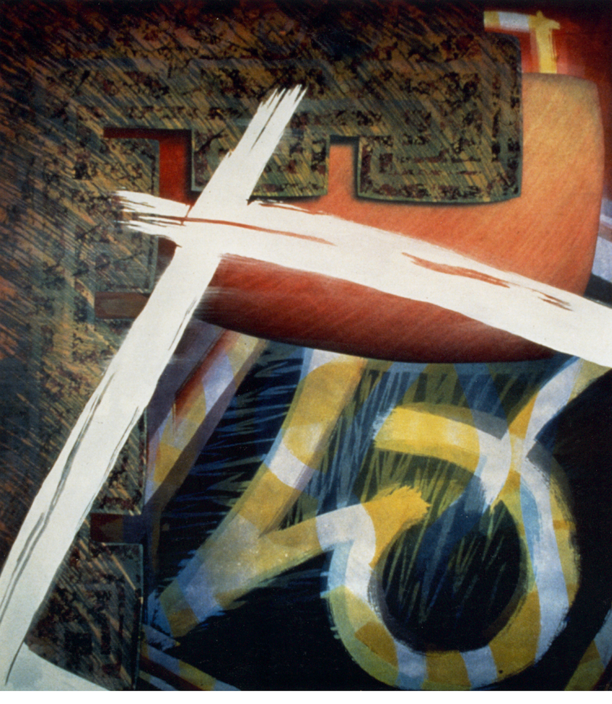
In the latter half of 1988, in painting number 131-0688, I decided to play with the idea of reinstating this missing motion created by edge through the use of large colorful, ribbon-like areas that would run parallel to these stagnant edges, giving them back their motion and fighting them with the tension of opposing colors. Soon, these wide, colorful lines were reduced to not much more, than narrow white chalk lines, as seen in painting number 134-1088. This appeared to not only bring back a greater type of motion but also, through the minimal placement of only two to three of these white lines, it amplified the painting’s entire intrinsic motion and structural composition.
*(In reference to the numbering of these paintings: The number “131” means that it was the 131 first painting created since the year of 1986 and completed during the month and year of 06/88.)
#131-0688 Varnished Chalk Pastel (32”X 40”) #134-1088 Vanished Chalk Pastel (40” X 60”)
The placement of white lines was so powerful to me that I thought of it as something similar to the motion of matter and how this is not just something that occurs on an inward level, but suggests an outer type of presence. Motion of this type or its illusion seemed to be so perfect that it must work in every dimension.
With this in mind, I started to justify the motion of each painting composition with lines drawn on tracing paper so as to go back and lay the motion onto the painting upside-down or even backwards. This created something similar to the visual creation of electricity or an electromagnetic field where, in the physical sense, one would do so by forcing like magnetic poles against one another. Here I visualize creating electricity by reversing the polarity of a composition’s motion or implied direction. A science that projects this type of idea of physical transformation might be electroacoustics, where sound is used to create electricity and visa versa. This visual experiment is seen in the painting titled, “The Reversal of Motion in Matter” #136-1188, or the combination of processes can be seen in such paintings as #138-0189 or #156-0989.
#136-1188 Varnished Chalk Pastel (40” X 60”)
#138-0189 Varnished Chalk Pastel (40” X 60”)
•Negative Space
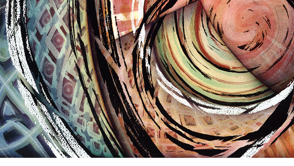
The paintings are also a reflection of my uncompromising inner vision for color: a quality of color that is almost impossible to produce with the use of traditional mediums and processes. To do this, I invented a process of statically applying chalk pastels and pure pigment to a cold-press watercolor paper that would eventually be varnished and polished to a glass-like surface. This medium allowed me to have up to 40 or more translucent under-paintings with an incredible sense of high-color density and clarity at the same time. The paintings are created with a process that I call “composition by deconstruction.” This process makes use of a conceptual “negative space”. The negative space is analogous to a photographic-negative except that it exists in a higher spacial dimension. By focusing on any one-brush stroke within the painting this can be revealed. For if one looks with an objective eye, not seeing what one’s mind has taught the eye to see, you will notice that you are seeing through the brush stroke, into an ocean of color and texture, not at the positive application of paint. As one looks through the brush stroke, as many as 30 to 40 under-paintings can be perceived. (See close up view below #321-0402 A).
The paintings are also a reflection of my uncompromising inner vision for color: a quality of color that is almost impossible to produce with the use of traditional mediums and processes. To do this, I invented a process of statically applying chalk pastels and pure pigment to a cold-press watercolor paper that would eventually be varnished and polished to a glass-like surface. This medium allowed me to have up to 40 or more translucent under-paintings with an incredible sense of high-color density and clarity at the same time. The paintings are created with a process that I call “composition by deconstruction.” This process makes use of a conceptual “negative space”. The negative space is analogous to a photographic-negative except that it exists in a higher spacial dimension. By focusing on any one-brush stroke within the painting this can be revealed. For if one looks with an objective eye, not seeing what one’s mind has taught the eye to see, you will notice that you are seeing through the brush stroke, into an ocean of color and texture, not at the positive application of paint. As one looks through the brush stroke, as many as 30 to 40 under-paintings can be perceived. (See close up view below #321-0402 A).
Close up view #321-0402 A Close up view #321-0402 B
#321-0402 varnished chalk pastel “Reversal of Shadow" Charles O.Wooldridge II © 2002
Another way of focusing on this is to look at the blackened areas (see close up view above #321-0402 B) and realize that one is not viewing a large black brush stroke but the removal of space around a blackened area, creating the opposite of many brush strokes that reveal a greater tension of space and the increase of speed in its motion. This type of broken image forces the viewers brain to put the painting together or to construct an image that really is not there. Semir Zeki, in the book “Inner Vision” would define this process as an “active process”, one that makes the viewer mentally construct the image as much, or more than, visually experience the image.
•Planar Relationship
Another study that I have pursued in the same area of “Line Verses Edge” is noticeable in the creation of the same planar relationships. This study incorporates the idea that emotionally and intellectually, not from a cellular or
neurological standpoint, we perceive linear compositions. This can have great effects on the use of color theory. In studying these planar relationships, my intent was to create a sense of purity or a resting place constructed of minimal lines and edges of color that are pitted against one another suggesting that, on an emotional level, one might see a positive or aggressive linear structure in the form of a point or acute angle. And on a neurological level, see a receding deep blue/green color, making the viewer’s emotional status interact with the intellectual perception of line structure, and over-come the cellular and neurological experience of color, thus swaying the interpretation of special placement.
|
#156-0989 Varnished Chalk Pastel (40” X 60”) #130-0688 Varnished Chalk Pastel (32” X 40”)
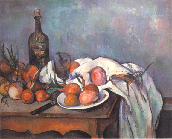
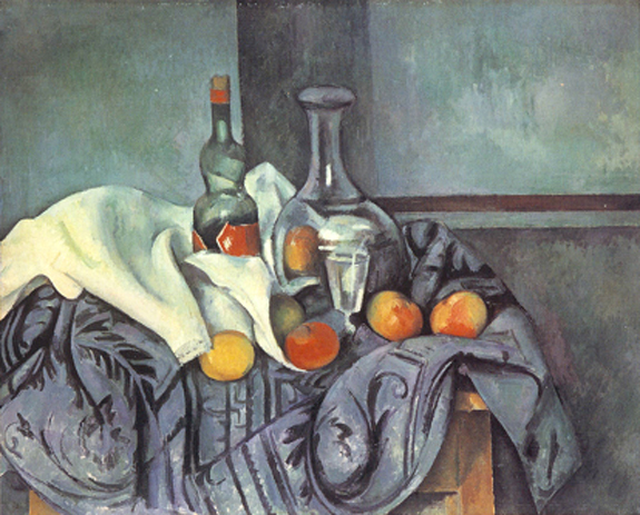
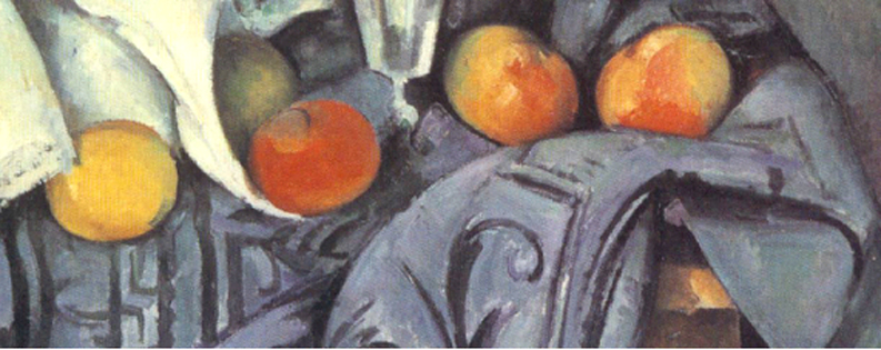
“Fourth of The Third Plane” The specific paintings that reflect this study were painted in the first six months of 1988 and were titled, “The Forth or The Third Plain.” By creating a compositional dynamic that uses only three planar relationships and color that is placed to juxtapose the linear composition, I found a constant fight between color theory and linear composition. This visual dynamic creates a floating sensation that almost imposes the feeling of a fourth plane or tension to the foreground of the painting. The first time I experienced this same powerful feeling was when I saw a painting of Cézanne’s, where the round orange fruit was floating over the sharp, dark corner of a table versus sitting on the corner. (See “Still Life with Onions. 1896-98” Cézanne) He would also produce the same effect by painting darker angular designs on a table cloth or using this drapery effect on a rugs surface its self, to create sharp or hard-lined images that would surround the brightly colored fruit almost as if they were attacking the fruit in a turbulent way. (See “Still Life with Peppermint Bottle and Blue Rug. 1893-95” and Close up) In this “close up” it is easy to see the effects of the aggressive angular forms as well as the pronounced “symbol-like” black lines that directly confront the soft brightly colored fruit. This perspective brings my visual models to their most primitive state, where line and edge are everything and whatever colors they may have entrapped, with their angular forms, predictable tensions will occur. These tensions are defined by the illusion of objects floating, the definitions of negative or positive space and the suggestion of different types of movement.
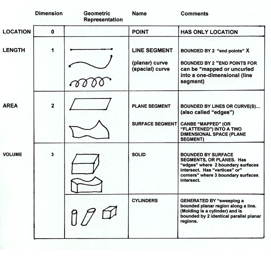
Without going in to subjects like “negative-positive space, color, or spacial concurrences”, the elements of line, edge, and color are like different homogeneous parts of a heterogeneous system of the visual world that work in certain amalgamate ways but cannot replace each other, so that line, edge, surface and color form a dimensional hierarchy, (see figure A; below). For instance, in math, addition and multiplication both deal with numbers but represent two different homogeneous systems and need to perform within certain contexts. One cannot use addition in place of multiplication but can use addition to prove multiplication, for (3+3+3=9) and (3x3=9) but (3+3) will never equal nine. It is my belief that art has many of the same behavioral elements. As an art student, I was greatly intrigued with Cézanne’s spacial experiments and was concerned with this and knew it was more than just the shifting of perspective, that maybe we had missed something along the way.
“Still Life with Onions. 1896-98” Cézanne “Still Life with Peppermint Bottle and Blue Rug. 1893-95” Cézanne Source: Cézanne “A Biography” John Rewald P. 211 Source: Cézanne “A Biography” John Rewald P. 211
Close up of “Still Life with Peppermint Bottle and Blue Rug. 1893-95” Cézanne
Since I was in third grade I have questioned the idea of “line”, and in my difficult love relationship with math and reading, at 23, I found an oasis in art. In the freedom, of this oasis, concepts like “edge” came to me quickly and with it the liberty to challenge the way life is projected to us through the use of such heterogeneous systems as line and edge that create symbols, contain color and suggest many things like movement. This arena was not one that demanded proof of anything but has aloud me to experiment and question every thing in a unique laboratory of visual tools. I have always felt that to create art, “one must do that which they do not know, in a movement of faith” and that the use of art has never been strictly about aesthetics, although truth can be aesthetically pleasing, it has been about the visual expression of concepts not already proven or the viewers unique relationship to a situation. This brings to mind a quote from the book Paintings and Diagrams From the Years 1957-1977 Alfred Jensen P.24 [“Thomas Kuhn’s theory (in The Structure of Science Revolution, 1970) the extraordinary gap between art and science, once bridged by Leonardo, deepened only when painting and sculpture “unequivocally renounced representation as their goal and began to learn again from primitive models.” Kuhn refutes the idea of linear progress in science, substituting instead the idea of the paradigm. Paradigms are achievements, which are unprecedented, open-ended enough to be unable to explain all facts with which they can be confronted, and which attract a group of followers away from competing models of activity.] Many great artists and scientists have endured this same phenomenon. |
|
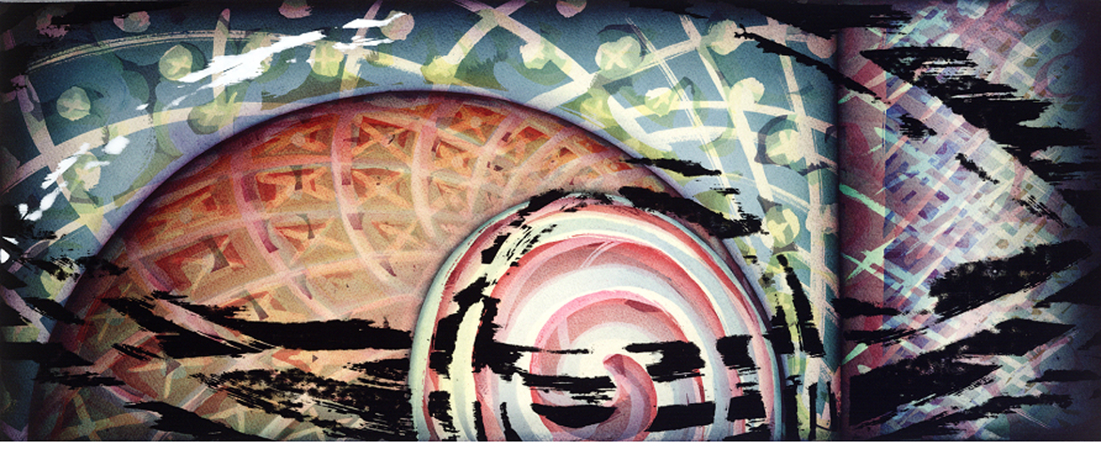
#322-0502 “Symbols Versus Texture” (12” X 42”) Charles O.Wooldridge II © 2002
Close up view of “Symbols Versus Texture” Charles O.Wooldridge II © 2002
My most recent painting, “Symbol Versus Texture,” #322-0502 is set in the complete illusion of mass and motion. One can see an area that produces the concept of a fiery, red-orange sphere and this sphere is made more dense by reducing the space between insinuated lines and the placement of the symbols “X” and “O”. The same symbols and suggested lines continue into an area that might be interpreted as a background and is painted in a receding, deep bluish- green with touches of dark violet and yellow. This background is made nebulous through the expansion and fanning out of the same implied lines and symbols seen within the sphere. I describe these lines as “insinuated” or “implied” for I am not quite sure they exist as lines at all. They are created in the same deconstructed or negative/reversed space that is referred to in the painting #321-0402 “The Reversal of Shadow,” and its close-up views (A) and (B). These particular lines encapsulate space as well as create elongated windows that are contained be two edges/sides of a reversed line and reveal and accentuate the many other reversed images below, giving a different definition to the concept of line. By this, I am saying that a line is not just an infinite quantity of points or that it divides space creating a left or right; I am suggesting that there is an entirely different intrinsic value at stake. That it opens the idea of a different heterogeneous system based in what I might call “Negative Space.”
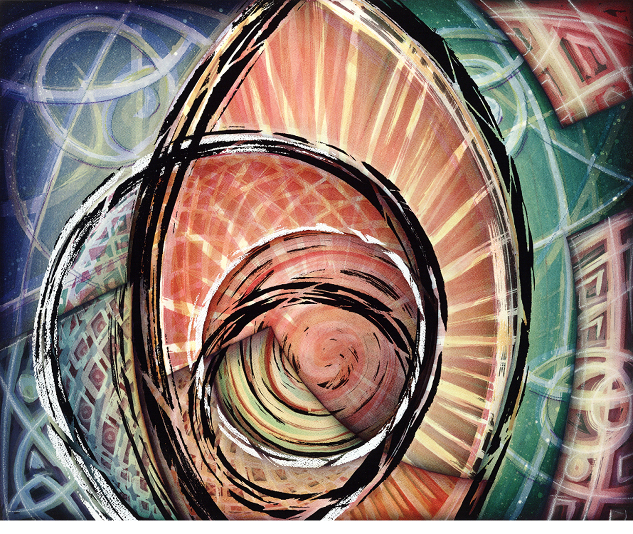
Through the use of these implied lines, these simple symbols “X” & “O” are created and are an attempt to replace a certain amount of texture in my paintings. For as humans struggle to put images together through observing recognizable forms and structures that rely on the elements possessed by lines and edges, a visual vocabulary is created of lines and edges and is dependent on the intellectual state of recognition and a subconscious level of emotional interpretation and inner-personal dialog. Through paintings like # 322-0502 “Symbols Versus Texture,” or #320-0402 “Enlightenment- Horizontal,” this line/edge-based dialog stands to be more powerful than the color theories of Goethe. I say this because when looking at these paintings it is easy to recognize that with the use of symbols to create texture something similar to an electrical term called impedance matching takes place, where the opposition to alternating current loads is equalized. In this case it is an intellectual and visual happening. The visually cool colors of the (X &O) background tend to float forward in a way that equalizes the hot aggressive qualities of the red and orange (X & O) foreground. This makes the warmer colors recede, and the cool back-ground colors come forward in a suspended fashion, as if to define or intellectually suggest, a most forward atmosphere of “X”s and “O”s that is almost three times deeper than if it were created with traditional forms of texture.
By using symbols to reproduce the effects of texture, it is easy to conclude that the viewer may be more attached to the intellectual gesture of line and edge than to the shading and shadowing of space and form that the effects of color can possess.
#320-0402 “Enlightenment-Horizontal” (28” X 32”)
Close up view of #320-0402 “Enlightenment-Horizontal” Charles O.Wooldridge II © 2002
In reading Semir Zeki’s statements from his book “Inner Vision,” about Plato’s description of Book X of The Republic on artists not being able to even paint a couch and John Constable’s “Platonic Idea” where it is quoted ‘the whole beauty and grandeur of Art consists … in being able to get above all singular forms, local customs, particularities of every kind…[The painter] makes out an abstract idea of their forms more perfect than any one original,” I have realized that I have never wanted to paint the couch nor did I ever desire to have my own
interpretation of the couch, but it was to search out some type of truth as to the existence of the couch. I am not resisting the truth that my work is spiritually, poetically, and aesthetically oriented, to say much more about this might trivialize it, but the question of, “How or if the couch even exists,” describes a large part of my studies over the last 25 years. This concept is strongly suggested in a painting created in November 1992, and titled “The Platonic Idea.”


